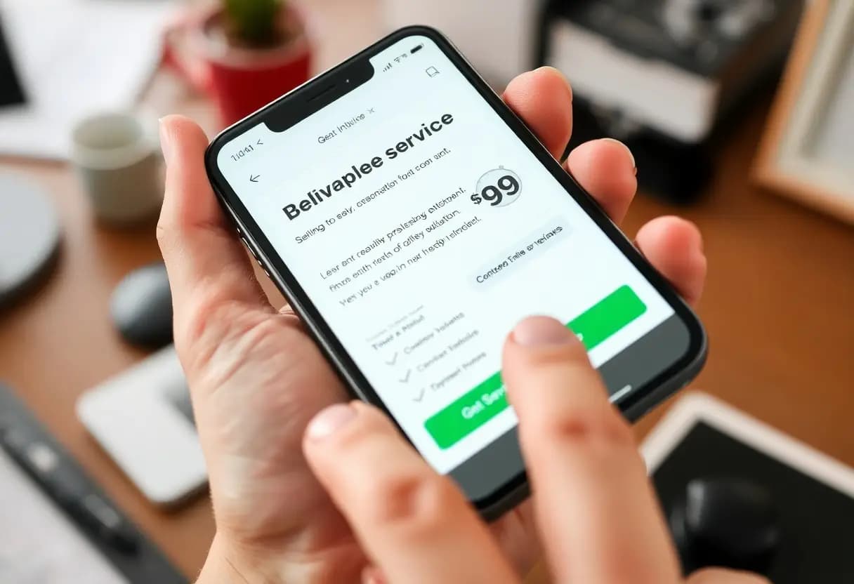
Many customers abandon websites when they can’t quickly understand what a service offers. A clear, well-structured service page removes confusion and highlights exactly how you solve their problem. You reduce hesitation by presenting direct benefits, pricing, and outcomes upfront, letting visitors decide with confidence in minutes, not hours.
Key Takeaways:
- Clear service pages give customers the exact details they need-like pricing, features, and benefits-so they can decide quickly without searching elsewhere.
- Well-organized information builds trust by showing transparency and reducing uncertainty about what the service offers.
- Using simple language and real-world examples helps users understand value faster, cutting down hesitation and speeding up conversion.
The Architecture of Persuasion
Strong service pages follow a clear structure that guides you toward confident choices. Each element works together to reduce confusion, presenting information in a way that feels intuitive. You’re more likely to act when the path forward is obvious, and every section reinforces trust. Clarity accelerates decision-making-especially when distractions are removed and messaging stays focused on your needs.
Headlines That Arrest Attention
Headlines shape your first impression within seconds. A sharp, specific headline stops you mid-scroll and signals relevance. When it speaks directly to your problem, you’re more likely to keep reading. Strong headlines don’t tease-they promise and deliver immediate clarity about what’s in it for you.
Benefit Driven Value Propositions
Value isn’t defined by features-it’s defined by what you gain. When you see clear benefits upfront, your decision becomes easier. Phrases that highlight time saved, stress reduced, or results guaranteed speak directly to your priorities. You respond to outcomes, not specifications, and smart service pages know this.
Imagine reading a service page that doesn’t list bullet points of technical capabilities but instead tells you exactly how your day will improve. That’s the power of benefit-driven messaging. Instead of saying “24/7 support,” it says “sleep easy knowing help is always one click away.” This shift from function to feeling makes the offer more relatable and emotionally compelling. You don’t just understand what’s being offered-you feel its impact. That’s what drives fast, confident decisions.
The Economy of Information
Every second you make your customer spend searching for answers is a second lost in trust and momentum. Clarity costs nothing but delivers everything-when your service pages cut through noise and deliver only what’s needed, decisions happen faster. You’re not just sharing information; you’re respecting time.
Eliminating Corporate Jargon
Words like “synergy” or “paradigm shift” don’t impress-they obstruct. Plain language builds confidence, while jargon raises suspicion. When you speak clearly, customers understand quickly, feel respected, and move forward without hesitation. Your expertise shows in simplicity, not complexity.
Direct Answers for Rapid Evaluation
You want clients to act, not decode. Answer key questions in seconds: What do you do? How does it help? What’s the next step? Place these answers upfront. When visitors find clarity immediately, they skip doubt and move straight to decision.
When someone lands on your service page, they’re not reading-they’re scanning for proof you can solve their problem. If the first thing they see is “transformative solutions,” they’ll leave. But if they read “We fix slow websites in under 72 hours,” they pause. Specificity creates credibility. You don’t need more content-you need better, targeted answers that align with what your customer already wants to know. This is how decisions accelerate.
Establishing Immediate Authority
You gain trust the moment visitors land on your service page. Clear, confident language signals expertise without hesitation. When customers see you speak with precision about your craft, they feel secure in choosing you over competitors who sound vague or generic.
Specificity in Results
Results matter more when they’re measurable. Instead of saying “we improve performance,” state exactly how much faster, cheaper, or more efficient you make things. Specific numbers build credibility because they can’t be faked, and customers notice the difference instantly.
Evidence of Professional Mastery
Proof of skill shows in the details-certifications, case studies, and precise methodologies. When you present real project outcomes with clarity, customers see you’re not guessing. This transparency separates professionals from amateurs and speeds up their decision to hire you.
What you display on your service page isn’t just information-it’s a silent salesperson working for you. A well-documented case study with before-and-after metrics, client names, and tangible results does more than impress; it eliminates doubt. Customers don’t need to email or call when they can already see you’ve solved problems just like theirs. That kind of proof doesn’t just suggest competence-it confirms it, making hesitation feel unnecessary.
The Path of Least Resistance
You make decisions faster when information flows naturally. Strong service pages guide you effortlessly from question to solution, removing friction at every turn. When you don’t have to search or guess, confidence in your choice grows-and so does your trust in the brand behind the page.
Reducing Choice Overload
You feel overwhelmed when faced with too many options at once. A focused service page presents only what you need, eliminating distractions. By limiting choices to clear, relevant paths, you avoid decision fatigue and move quickly toward taking action.
Intuitive Navigation Logic
You expect to find what you need without thinking too hard. Logical grouping of content, predictable menu labels, and a clean layout help you follow the flow naturally. When navigation feels invisible, you’re more likely to stay engaged and convert.
Intuitive navigation logic works because it aligns with how you already think. Instead of forcing you to learn a new structure, it mirrors your mental model-placing pricing near features, support near onboarding, and benefits near headlines. This alignment reduces hesitation, making every click feel like progress, not a gamble.
The Call to Decisive Action
You need clarity, not clutter, when guiding customers toward a decision. A strong service page cuts through hesitation by presenting a clear next step. When visitors know exactly what to do-whether it’s scheduling a call, starting a trial, or making a purchase-they act faster. Indecision costs conversions; a direct call to action prevents drift.
Singular Focus for Results
Every element on your service page should serve one goal: moving the customer toward conversion. When you highlight a single offer or solution, distractions fade. You’re not asking them to compare five options-you’re showing them the best path. Clarity drives confidence, and confidence drives action.
Removal of Transactional Friction
Hidden fees, complicated forms, or unclear timelines stop buyers in their tracks. Remove these barriers so nothing stands between interest and action. Simple forms, upfront pricing, and visible support options make the process feel safe. Frictionless experiences convert-even small delays can kill momentum.
When customers hesitate, it’s often not about desire but difficulty. If they can’t quickly understand pricing, availability, or what happens after they click “buy,” trust erodes. Display guarantees, reduce form fields to only what’s crucial, and confirm actions instantly. A smooth transaction signals professionalism and reliability, making the decision feel effortless and secure.
Conclusion
Now you see how strong service pages guide your choices with clear, focused information. They present what you need-quickly and confidently-so you spend less time searching and more time deciding. Well-built pages answer your questions before you ask them, making your path to action direct and informed.