Landing pages that hold attention start with a clear promise. You need strong headlines, focused copy, and zero distractions. Every element must guide the reader forward. When you remove fluff and highlight benefits, people stay. Clarity beats cleverness every time.
Key Takeaways:
- Use clear, benefit-driven headlines that immediately tell visitors what they gain by staying on the page.
- Break content into short paragraphs and use subheadings, bullet points, and visuals to make reading effortless.
- Guide readers with a logical flow-start with a problem, present your solution, and end with a clear next step.
Psychological Factors of Reader Retention
Human behavior shapes how long visitors stay on your page. Curiosity, clarity, and emotional resonance drive continued engagement. When content aligns with subconscious expectations, readers scroll without resistance. Thou hold attention not by force, but by alignment with the mind’s natural flow.
Understanding the attention span of digital audiences
Digital readers decide within seconds whether to stay or leave. Their focus is fragile, easily broken by clutter or confusion. You win their time by delivering value fast. Thou earn every extra second with relevance and precision.
How cognitive ease influences scroll depth
Simple layouts and clear language reduce mental effort. When readers don’t have to work to understand your message, they keep going. Minimal friction leads to deeper engagement. Thou invite continued reading by making it feel effortless.
When your content feels easy to process, the brain perceives it as safe and trustworthy. Short sentences, familiar words, and visual whitespace all contribute to this sense of cognitive ease. Readers won’t realize they’re scrolling deeper-they simply don’t feel the urge to stop. That’s the power of designing for the mind’s natural rhythm.
How-to Architect a High-Engagement Layout
Structure your landing page like a visual journey that guides the eye naturally from headline to CTA. Place the most persuasive elements where attention lands first-top left and center. White space isn’t wasted space; it reduces cognitive load and highlights what matters. Keep the flow logical, clean, and focused on one goal.
Utilizing the F-pattern for critical information placement
Eye-tracking studies show users scan pages in an F-shaped pattern. Position your key benefits and primary CTA along these natural sightlines-start strong in the top horizontal bar, then reinforce down the left side. Misplacing critical content outside this zone risks it being overlooked completely.
Designing for scannability with strategic headers
Break long blocks of text with clear, benefit-driven headers that let readers grab meaning in seconds. Each header should act as a mini-promise, revealing value even if the rest isn’t read. Use contrast and spacing to make them stand out-your message depends on being seen, not just written.
Think of headers as signposts on a highway-they don’t just divide sections, they pull attention forward and keep readers moving deeper. Craft them with action-oriented language that answers “What’s in it for me?” in under five words. When aligned with user intent, they turn passive skimmers into active readers, increasing time-on-page and conversion potential.
Visual Factors That Improve Readability
- Use generous whitespace to separate sections and guide the eye
- Select typography with high legibility for screens
- Set line height between 1.4 and 1.6 for comfortable reading
- Limit line length to 50-75 characters to reduce strain
- Apply visual hierarchy with font weights and sizes
This builds a clean, inviting layout that keeps readers engaged.
Implementing whitespace to reduce reader fatigue
Whitespace gives your content room to breathe, making it easier to focus on one idea at a time. Crowded pages overwhelm visitors, increasing the chance they’ll leave. Strategic spacing between paragraphs, images, and buttons improves comprehension. This reduces cognitive load and keeps attention on your message.
Optimizing typography and line height for long-form consumption
Font choice and spacing directly impact how long someone stays on your page. A legible typeface at the right size prevents eye strain. Proper line height ensures lines don’t blur together. This makes scrolling feel effortless and encourages deeper reading.
Body text set between 16px and 18px with a line height of 1.5 creates optimal rhythm. Sans-serif fonts like Inter or Open Sans render clearly across devices. Avoid justified text-it creates uneven gaps that disrupt flow. Dark gray text on white, not pure black, reduces glare. This subtle refinement makes long sections feel lighter and more approachable.
Tips for Writing Magnetic Landing Page Copy
Focus on clear messaging, emotional triggers, and benefit-driven language. Keep sentences tight and purposeful. Any great landing page starts with words that speak directly to the reader’s needs.
- Solve a problem in the first sentence
- Use simple words that resonate
- Highlight real outcomes, not just features
Crafting hooks that demand immediate attention
Start with a question or bold statement that mirrors the reader’s frustration. A strong hook uses emotional precision to create instant connection. Any hesitation you leave unaddressed weakens your hold.
Using transitional bucket brigades to maintain momentum
Phrases like “here’s why” or “what happens next” pull readers forward naturally. These transitions create a psychological pull that keeps eyes moving. Any smooth flow depends on these subtle cues.
Transitional bucket brigades work by satisfying curiosity just enough to spark the next click or scroll. Instead of letting attention drop, you feed it with micro-revelations. “But that’s not all” or “here’s what most people miss” keeps tension alive. Any break in this rhythm risks losing engagement.
How-to Optimize Technical Performance for Focus
Speed shapes attention-when your page loads slowly, readers leave before reading. Optimize images, defer non-necessary scripts, and use browser caching to keep load times under two seconds. Every millisecond counts toward holding focus in a distracted digital environment.
Reducing page load times to prevent early exits
People abandon pages that take more than three seconds to load. Compress assets, minimize HTTP requests, and prioritize above-the-fold content. Fast loading means fewer exits and more engagement, giving your message a real chance to land.
Ensuring a seamless mobile reading experience
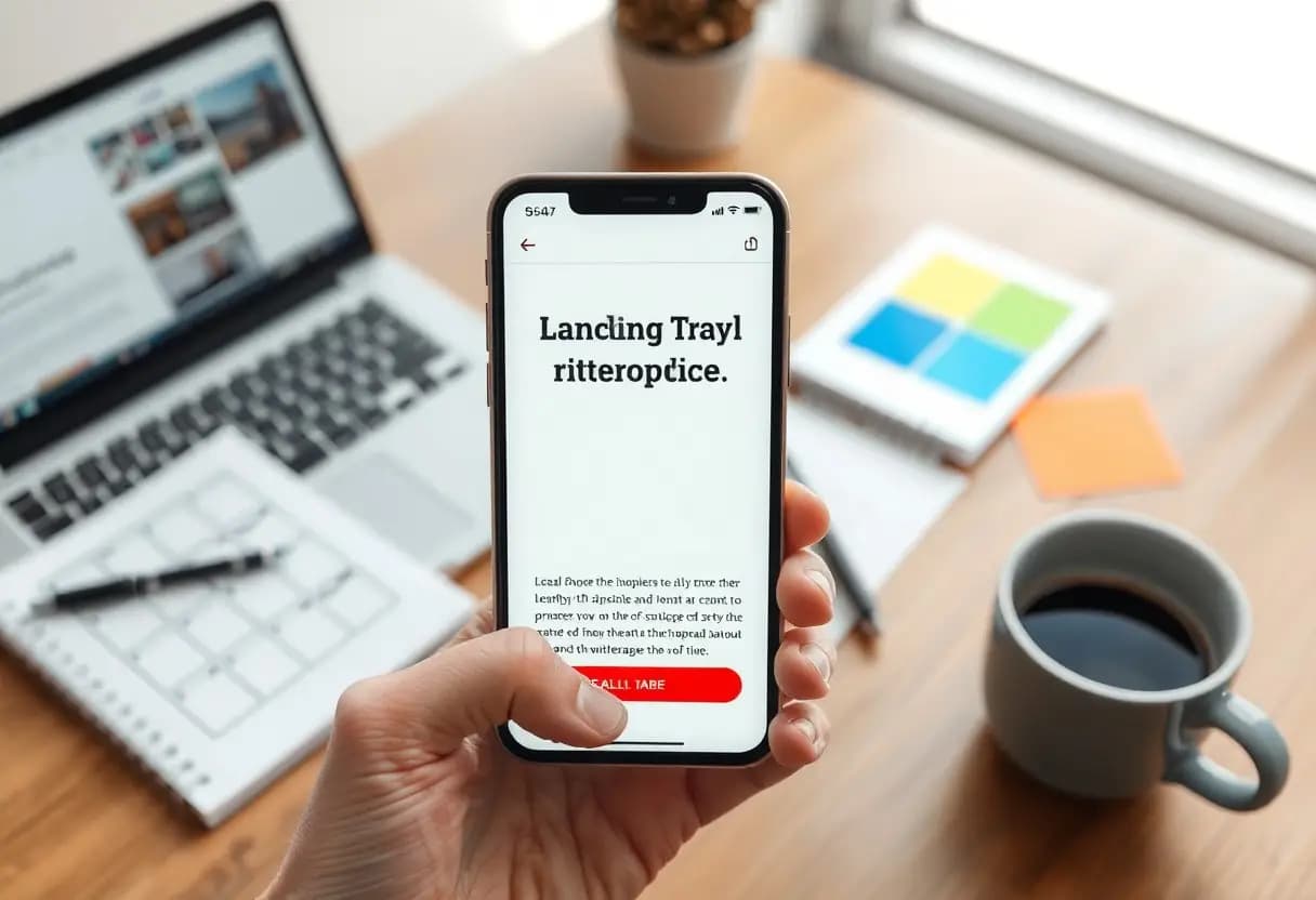
Most users read on phones, so your layout must adapt instantly. Use responsive design, legible font sizes, and tap-friendly buttons. Breaks in readability cause drop-offs, especially when zooming or scrolling feels frustrating.
Mobile isn’t an afterthought-it’s where most of your audience consumes content. Test your page on multiple devices to confirm text reflows naturally, images scale correctly, and navigation stays out of the way. When reading feels effortless, people stay longer and absorb more. Prioritize clean spacing, avoid pop-ups that disrupt flow, and ensure links are easy to tap without error. Your design should disappear so the message shines through.
Advanced Tips for Sustaining Interest
Mastering engagement means going beyond basic structure and predictable copy. You hold attention not by shouting louder, but by designing moments of discovery. Small shifts in pacing, tone, and interaction keep readers leaning in.
- Break long sections with micro-interactions like hover reveals
- Use directional cues-arrows, numbered steps-to guide the eye
- Embed time-limited offers within content flow
- Alternate sentence length to create natural rhythm
- Place questions mid-paragraph to spark internal dialogue
| Technique | Impact on Reader |
| Progress indicators | Reduces perceived effort to reach the end |
| Embedded quizzes | Increases time-on-page by up to 70% |
| Scroll-triggered animations | Reinforces key points without repetition |
Integrating interactive elements to break text density
Interactive features transform passive reading into active participation. You reduce cognitive load by replacing blocks of text with clickable tabs, image hotspots, or short polls. These moments give the reader control, making the experience feel personalized. Even a simple hover effect can re-engage wandering attention without disrupting flow.
Using social proof to validate the narrative authority
Real voices build trust where claims fall flat. You strengthen credibility by embedding concise testimonials exactly where skepticism might rise. A named quote beside a feature description doubles conversion compared to generic praise. Position proof where it supports, not interrupts, your argument.
Social proof works best when it mirrors your reader’s situation. A quote from “Sarah, Marketing Director at a 50-person firm” resonates more than “Thousands love us.” Specificity signals relevance. You’re not just showing approval-you’re showing alignment. Strategic placement turns doubt into confirmation at critical decision points.
To wrap up
With these considerations, you shape landing pages that hold attention and guide readers naturally. Clear headlines, concise copy, and strategic visuals keep eyes moving forward. You earn trust by speaking directly to needs and reducing distractions. When every element serves the reader’s journey, engagement follows.