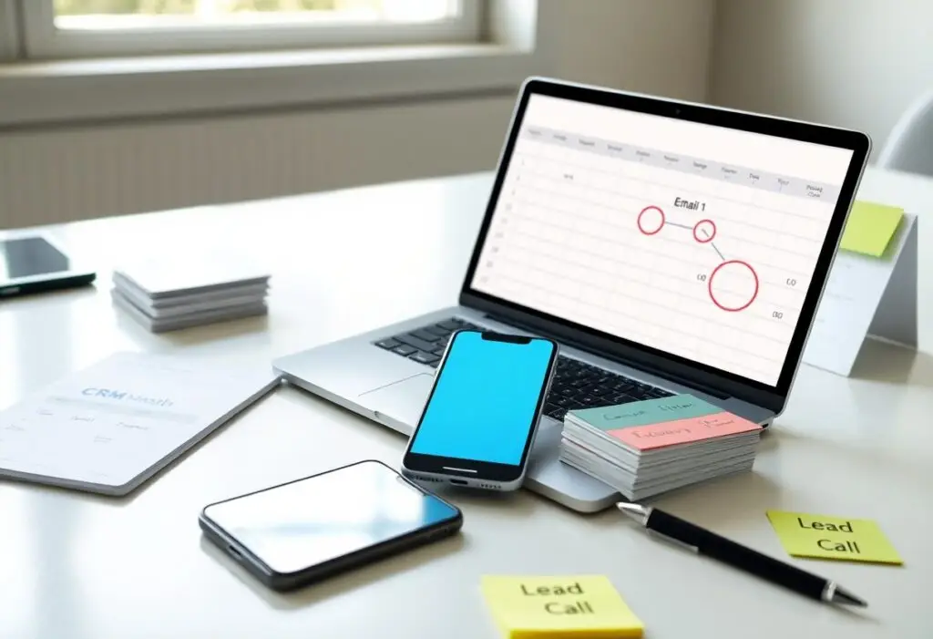
Conversion begins the moment a visitor lands on your site, but poor design, slow load times, and unclear contact information can drive them away instantly. You lose opportunities when users can’t find what they need within seconds. A single confusing layout or missing phone number may be the difference between a call and a bounce. Your website must work for you-silently guiding visitors toward action.
Key Takeaways:
- Slow loading times frustrate visitors-many abandon a site if pages take more than a few seconds to load, especially on mobile devices.
- Unclear contact information or missing call-to-action buttons make it difficult for users to know how to reach a business, reducing the chance they’ll make the effort to call.
- Poor mobile design, including tiny text and hard-to-tap links, drives users away because they can’t easily access the information they need.
The Stickiness of First Impressions
You form judgments about a website in less than a second. That instant assessment decides whether you stay or leave. A cluttered layout, slow load time, or unprofessional design triggers immediate doubt. Trust evaporates before your message is even read. First impressions aren’t just influential-they’re often irreversible.
Visual noise and cognitive load
Too many fonts, colors, and animations overwhelm your brain. Each unnecessary element increases mental effort. Clarity suffers when users must filter distractions instead of focusing on your offer. Simplicity isn’t just aesthetic-it’s functional. A clean design guides attention where it matters most.
Navigational puzzles
When you can’t find what you need in seconds, frustration builds. Hidden menus, vague labels, or broken links make your site feel like a maze. Users won’t hunt for information-they’ll simply leave. Clear, logical paths are non-negotiable for keeping people engaged.
Imagine landing on a site where the “Contact” button is buried under three dropdowns or labeled “Let’s Talk” without any visual cue. You hesitate, then backtrack. That hesitation is a warning sign. Every extra click or confusing label adds friction. Friction kills conversions. Users expect intuitive access to key information-especially when they’re ready to act. If your navigation forces them to guess, you’re handing them a reason to abandon your site and call a competitor instead.
The Tipping Point of Trust
You lose visitors the moment doubt creeps in. Trust isn’t built in one grand gesture-it’s earned through consistent, subtle cues. When those signals fail, the decision to leave happens in seconds, often before your value is even considered.
Missing signals of credibility
Customers look for proof you’re legitimate before engaging. No address, missing phone number, or absence of client logos tells them you can’t be trusted. Without these basic markers, your site feels like a dead end, and they’ll exit without a second thought.
Aesthetic failures
Clashing colors, broken layouts, or outdated design suggest neglect. Your site’s appearance forms an instant impression-one that often overrides logic. When visuals feel unprofessional, visitors assume the business behind them is too.
Outdated fonts, misaligned buttons, and low-resolution images don’t just look bad-they signal incompetence. Users equate design quality with service quality. If your site looks like it hasn’t been updated in a decade, they’ll assume your business operates the same way. A single awkward layout can be enough to kill confidence and drive someone to your competitor.
The Paradox of Choice
Too many options paralyze your visitors instead of empowering them. When faced with endless services, products, or pathways, people often walk away rather than risk choosing wrong. Indecision becomes the default action, and your site loses momentum. Simplicity guides decisions-clarity wins every time.
Decision fatigue
Your brain tires after making too many small choices. Every menu, pop-up, or form field drains mental energy. Once exhausted, visitors abandon the page instead of calling. Reducing cognitive load increases conversion. Streamline every step to preserve their focus for the action that matters.
Vague calls to action
Phrases like “Learn More” or “Click Here” leave visitors guessing what happens next. Unclear CTAs kill momentum and erode trust. When people don’t know the benefit or outcome, they disengage. Precision in language drives action-say exactly what you want them to do.
Imagine seeing a button that says “Get Started.” That could mean anything. Now imagine “Call Now for Your Free 15-Minute Consultation.” The second tells you the action, the time commitment, and the benefit. Specificity removes doubt and makes the next step feel safe. When your CTA answers the question “What’s in it for me?”, you dramatically increase the odds they’ll follow through. Ambiguity is your enemy-clarity is your conversion engine.
The Broken Window of Technical Speed
Speed shapes every decision a visitor makes on your site. If pages lag, trust erodes before your message even loads. Users equate slow performance with incompetence, and one delayed interaction often ends in abandonment. You’re not just losing time-you’re losing credibility with every extra second.
The speed barrier
People expect instant responses, and delays as short as two seconds increase exit rates. Every millisecond of hesitation chips away at engagement, especially on landing pages meant to convert. If your site doesn’t respond immediately, you’re silently telling visitors their time doesn’t matter.
Mobile friction
Most users browse on phones, yet many sites still fail basic mobile performance. Clunky navigation, unresponsive buttons, and zooming struggles create instant frustration that kills intent. When tapping feels like work, calling is no longer an option-they’ve already left.
Mobile friction goes beyond slow loading-it’s about interaction quality. Misaligned forms, tiny clickable areas, and pop-ups that block content turn simple tasks into obstacles. You might think your contact button is visible, but if it’s hard to tap on a small screen, it might as well not exist. Designing for mobile means respecting how people actually use devices, not just shrinking desktop layouts.
The Language of the Vital Few
You speak to a select group whose time is valuable and attention limited. Clarity wins when every word must earn its place. If your message doesn’t align with their immediate need, they leave without a trace. Precision isn’t stylistic-it’s survival.
Misaligned headlines
Your headline promises one thing but the page delivers another. This mismatch kills trust instantly. Visitors notice the disconnect in seconds and exit, convinced you don’t understand their problem. Match your message to their mindset or lose the sale before it starts.
Jargon barriers
Industry terms obscure meaning instead of clarifying it. Confusion leads to abandonment-you sound like everyone else, not like someone who sees their real struggle. Replace acronyms and technical language with plain speech that invites understanding.
Jargon doesn’t impress-it distances. When you use terms your audience must decode, you force them to work for meaning. Effort without reward drives people away. Replace insider language with direct, human phrasing that reflects how real people talk about their problems. Simplicity builds connection; complexity builds exits.
The Blink Moment of Departure
You make split-second decisions every time you land on a new site. Within moments, your brain decides whether to stay or leave. This instant judgment often happens before the page fully loads. If the first visual impression feels off, confusing, or untrustworthy, you’re already reaching for the back button.
The five-second judgment
Your mind assesses credibility almost instantly. In under five seconds, you decide if a website deserves your time. A cluttered layout, poor writing, or missing contact details triggers immediate doubt. If the purpose isn’t clear right away, you assume the business isn’t either.
The ease of the back button
One click erases the visit completely. The back button requires zero effort and leaves no trace. When something feels even slightly off, you use it without hesitation. That simplicity makes it the most dangerous tool for websites trying to earn your attention.
Consider how effortless it is to abandon a site. You don’t need to close the browser-just one tap returns you to safety. This frictionless exit means hesitation equals departure. There’s no penalty for leaving, no follow-up, no second chance in that moment. If your site doesn’t capture trust immediately, you’ve already lost.
Conclusion
Conclusively, you leave a website without calling when the content feels unclear, the design frustrates navigation, or contact options are hard to find. Slow load times, excessive ads, or lack of trust signals push you away. Your decision happens in seconds-make every element count to keep you engaged and ready to act.