Many beautiful websites fail because visual appeal alone doesn’t drive action. You might have stunning design, but if your message is unclear or your calls to action are weak, visitors leave. Poor user experience and slow load times destroy trust fast. Clarity, speed, and purpose matter more than aesthetics when converting visitors into customers.
Key Takeaways:
- A visually appealing website doesn’t guarantee user trust if it lacks clear messaging, social proof, or easy navigation-visitors leave when they can’t quickly understand what you offer or why they should care.
- Fast loading speed and mobile responsiveness matter more than design flair-many pretty sites slow down performance or break on phones, driving potential customers away within seconds.
- Without a clear call to action or simple path to purchase, even the most stunning websites fail to convert-design should serve the user’s goal, not just impress with aesthetics.
The Fatal Sin of Aesthetic Vanity
You’ve seen it before-a site so polished it feels like a digital art gallery. Beauty becomes a trap when it replaces function, slowing load times and burying calls to action. Your visitors don’t come to admire design; they come to solve problems. When style speaks louder than purpose, conversion stays silent.
When Art Ignores the Sale
Artistry has its place, but not at the cost of clarity. Every pixel should serve a goal, not just a mood. If your homepage feels like a mood board instead of a pathway, you’re guiding eyes, not customers. Design that doesn’t direct is decoration, not strategy.
The High Cost of Mere Decoration
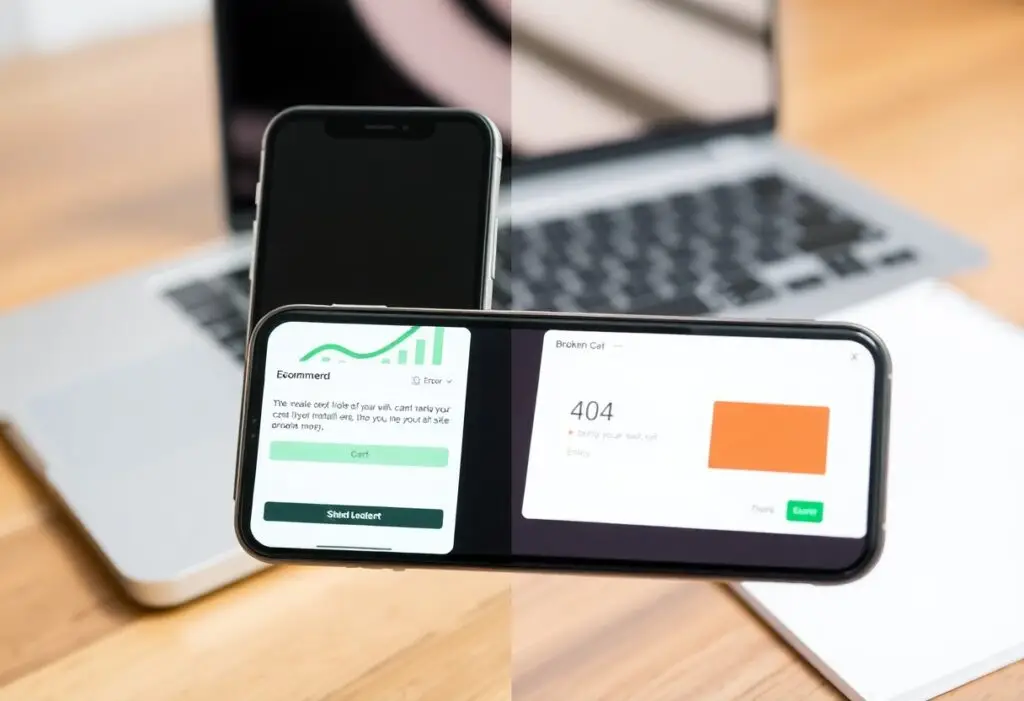
Excess visuals drain performance and patience. Slow loading kills interest within seconds. That animated hero image? It might look stunning, but if it delays access to your offer, it’s costing you sales. Every decorative element must justify its weight in conversions.
Performance isn’t just technical-it’s psychological. Each extra second of load time increases abandonment, and decorative elements often carry the heaviest load. You’re not just paying in hosting fees or development hours; you’re paying in lost trust and missed opportunities. A sleek background video might impress for three seconds-then frustrate for ten.
The Muted Sales Engine
Your website might look flawless, but if it doesn’t guide visitors toward buying, it’s just digital decor. Beauty without direction fails to convert, no matter how polished the design. You’ve built a showroom with no doors-impressive to see, impossible to act within.
Invisible Directives
Every page should tell the visitor exactly what to do next. When calls to action are buried or vague, you leave decisions to chance. A missing button, a weak headline, or passive language kills momentum. You’re not being subtle-you’re being ignored.
Confusing the Prospect
Too many choices, unclear benefits, or technical jargon make your offer feel risky. Confusion always leads to inaction. You assume clarity, but your visitor sees noise. If they can’t grasp your value in seconds, they’ll simply leave.
When someone lands on your site, their first question is “What’s in it for me?” If your messaging forces them to think too hard, you’ve already lost. Using internal language, stacking features without outcomes, or hiding pricing behind layers creates friction. Prospects don’t want puzzles-they want relief. Every confusing detail increases doubt, and doubt kills sales faster than poor design ever could.
The Speed of Lost Profit
Every second your site takes to load costs you real revenue. Slow performance drives visitors away before they even see your offer. You’re not just losing attention-you’re losing sales the moment the page stalls.
Heavy Graphics vs Rapid Utility
Flashy animations and high-res images may look impressive, but they often cripple loading times. You trade visual appeal for function, and customers choose speed over style every time. Simplicity wins when it delivers value faster.
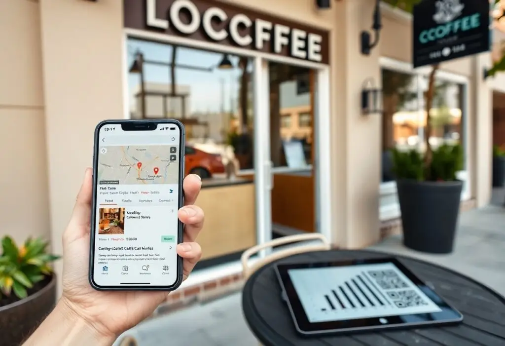
The Impatient Customer
You expect instant results when you search-so do your customers. Over half of visitors abandon sites that take more than three seconds to load. Their patience is zero, and their loyalty is earned in milliseconds.
Think about your own behavior online: how often do you wait more than a few seconds for a page to load? Your customers act the same way, and each delay increases the chance they’ll click away permanently. Speed isn’t just a technical detail-it’s your first impression, your credibility, and your conversion rate all in one.
Copywriting Smothered by Design
Design can dominate your message when visuals overpower clarity. You might love how sleek your site looks, but if users can’t quickly grasp what you offer, they’ll leave. Strong copy gets buried under animations, oversized images, and trendy layouts that sacrifice readability for aesthetics.
Style Over Substance
Beauty means little when it doesn’t serve a purpose. You may have invested in a stunning layout, but if every element screams “look at me” instead of guiding action, your conversions will suffer. A clean, functional design supports your message-not replaces it.
Vague Value Propositions
Phrases like “we’re different” or “top-quality service” tell you nothing. When your value proposition lacks specificity, prospects have no reason to stay. You need clear, direct language that answers the only question that matters: “Why should I care?”
Imagine landing on a homepage that says “innovative solutions for forward-thinking clients.” What does that actually mean? You’re left guessing. Strong value propositions name the problem, state the benefit, and differentiate from competitors-all in seconds. Without this clarity, even the prettiest site becomes a digital brochure nobody reads.
The Architecture of Conversion
Your website’s design must serve a purpose beyond aesthetics. Every element should guide visitors toward a desired action, whether it’s signing up, calling, or buying. A beautiful layout means nothing if users can’t find what they need. Structure your site around conversion goals, not just visual appeal.
Prioritizing User Intent
You know visitors arrive with specific goals in mind. Align your content and navigation with what they’re actually searching for, not what you assume they should want. Misreading intent leads to confusion, high bounce rates, and lost opportunities. Match their mindset at every touchpoint.
Simplifying the Path to Purchase
Reduce the steps between interest and action. Each extra click increases the chance of abandonment. Make buttons visible, forms short, and checkout fast. Clarity beats cleverness-your customer doesn’t want a puzzle, they want a solution.
When you streamline the journey to purchase, you remove friction that silently kills conversions. Hidden pricing, mandatory account creation, or unclear CTAs force hesitation. A direct, intuitive flow turns interest into action without second-guessing. Test each stage ruthlessly-what seems obvious to you may confuse your audience.
Summing up
Following this, you understand that aesthetics alone don’t drive customer action. Your website may look polished, but without clear messaging, intuitive navigation, and trust signals, visitors leave. Design supports function-it doesn’t replace strategy. You need purpose behind every element to convert interest into results.